
“Visualization is the delicate art of crafting insights into narratives that echo universally and captivate with beauty.”
– Bidya Bhushan Bibhu (Product Manager-Data)

Introduction:
In the world we live in today, where data is king, the knack to pull out valuable insights from a sea of information is vital. Data analytics is the detective, finding hidden clues and patterns.
On the other hand, data visualization is the storyteller, making these clues come alive. It’s not just about making pretty charts; it’s about making sense of the data and sharing it in a way that everyone in the organization can understand. It’s about speaking the language of data in the simplest way possible.
Importance of Data Visualization:

Data visualization is like a translator, turning the complex language of data into visuals like charts, graphs, and maps that we can all understand. It’s a game-changer, transforming how we interpret and share information.
Here’s why it’s so important:
Identifying trends and patterns:

- Visuals give us a bird’s eye view of data, helping us spot complex relationships and outliers that might get lost in the shuffle of raw data. For example, a simple line chart showing sales over time can quickly highlight seasonal trends and busy periods.
Communicating insights clearly:

- Engaging visuals draw in audiences and make understanding complex and multi-layered data sets a breeze. Picture this — you’re presenting customer feedback through a word cloud. The most used words pop out, highlighting the overall sentiment. It’s a simple yet powerful way to make data accessible to everyone.
Supporting decision-making:
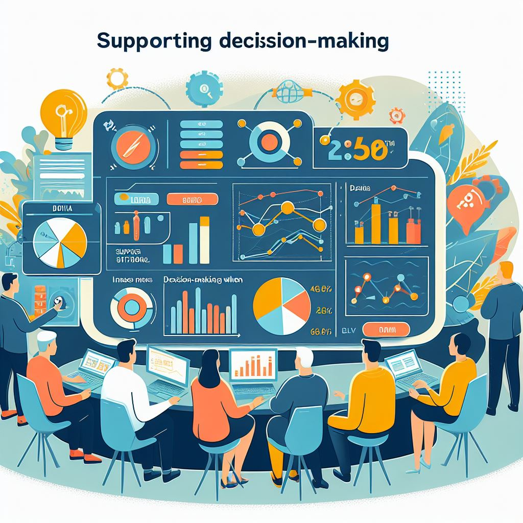
- Data visualizations are more than just pretty pictures; they’re powerful tools that bring data-driven decisions and strategies to life. Imagine a dashboard filled with interactive elements, created using tools like Tableau.
- This isn’t just a static image; it’s a dynamic interface that provides real-time insights into key performance indicators (KPIs).
- Let’s say you’re a business leader. With a glance at this dashboard, you can see how your sales are trending, which products are most popular, and how customer satisfaction rates are changing over time. You can drill down into specific regions, time periods, or demographics. You can see the big picture and the fine details, all in one place.
- This isn’t just about making your life easier (though it certainly does that). It’s about making your decisions better. With clear, up-to-date information at your fingertips, you can make swift, informed decisions that drive your strategy forward. You’re not just reacting to what’s happening now; you’re anticipating what could happen next.
- In a world where data is constantly being generated, data visualization is the compass that guides you through the sea of information. It’s not just about understanding the data; it’s about using that understanding to make better decisions and build stronger strategies. That’s the power of data visualization. It’s a game-changer in today’s data-driven world.
Driving engagement:
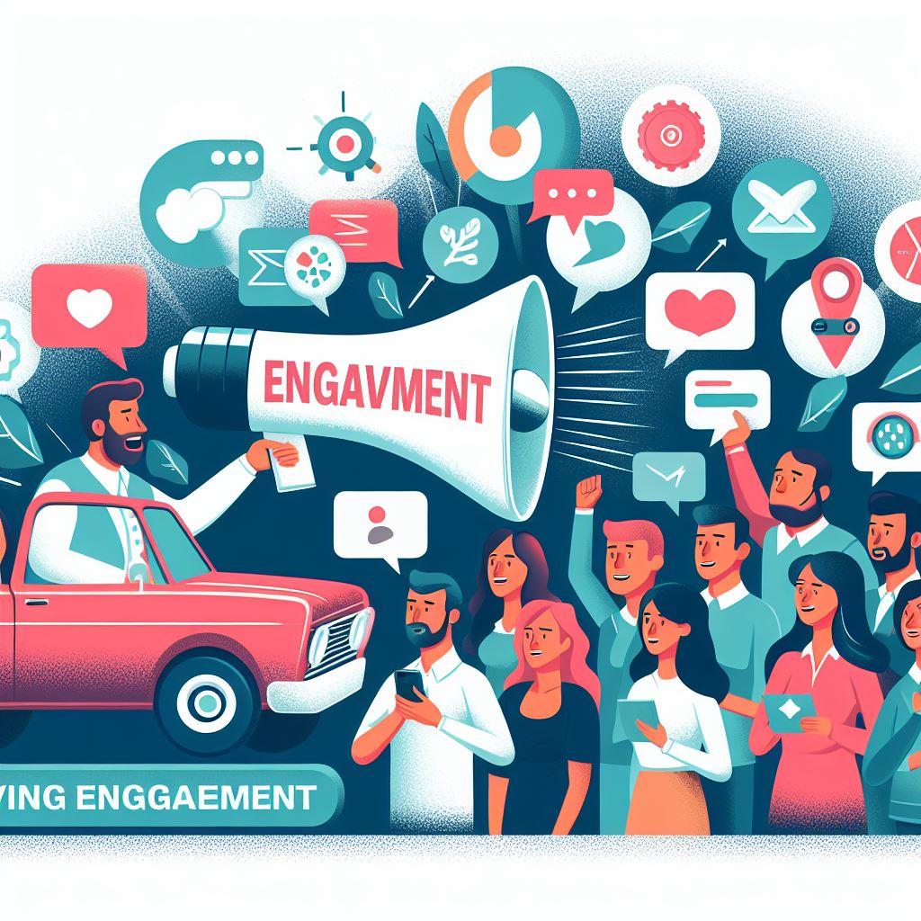
- Data visualization is like a universal language that brings data to life, making it more accessible and engaging. It’s a catalyst for collaboration, sparking conversations and building consensus among different teams and stakeholders.
- Consider this — you have a geographic map that overlays customer distribution. It’s not just a map; it’s a visual story of where your customers are located. You can see at a glance where your customers are clustered, where they’re sparse, and where there are opportunities for growth.
- This isn’t just useful for you; it’s useful for your entire team. The marketing team can use this information to tailor their campaigns based on regional preferences. The sales team can identify potential hotspots for new sales. The product team can understand where their products are most popular and why.
- But it’s not just about what you can see; it’s about what you can do with what you see. With data visualization, you’re not just understanding your data; you’re using it to make informed decisions, to strategize, and to drive your business forward.
- In a nutshell, data visualization is a powerful tool that fosters collaboration and buy-in, making data a team sport. It’s about making data accessible, engaging, and actionable for everyone in the organization. It’s about turning data into insights, and insights into action. That’s the power of data visualization. It’s a game-changer in today’s data-driven world.
Why Learn Data Visualization?
In the current competitive job market, the acquisition of data visualization skills goes beyond being a professional advantage; it is a career catalyst. Mastering data visualization can:
- Boost your career: Organizations seek professionals with the ability to transform complex data into actionable insights. Those proficient in data visualization often find themselves at the forefront of new job opportunities and higher salary brackets.
- Enhance your communication: The art of effective data insight communication is critical across various industries. Visualization enables professionals to convey complex information in a visually digestible manner, ensuring effective communication at all levels.
- Improve your problem-solving: Visualizing data aids in the identification of problems and potential solutions more effectively. For example, a pie chart illustrating the breakdown of project expenses can pinpoint areas of overspending, prompting strategic adjustments.
- Stay ahead of the curve: As the volume of data continues to grow exponentially, data visualization skills will become even more essential. Professionals equipped with these skills can navigate and harness the power of vast datasets, staying ahead in their respective fields.
Popularity in the Corporate Sector:
Data visualization has become increasingly indispensable for businesses across various industries, aiding them in:
- Gaining insights into customer behavior: Visualizing customer demographics, purchase trends, and sentiment analysis provides a comprehensive understanding, enabling improved marketing and sales strategies. A heat map showcasing customer interactions on an e-commerce platform can reveal areas of high engagement and identify potential areas of improvement.
- Tracking operational performance: Dashboards and reports monitoring key metrics such as sales, production, and costs help organizations identify areas for improvement. Visualizing operational data in real-time allows quick adjustments to enhance efficiency and productivity.
- Managing risks and identifying opportunities: Analyzing financial data and market trends through visualizations empowers organizations to make informed investment decisions and mitigate risks. For instance, a bubble chart representing market trends can highlight potential investment opportunities and associated risks.
- Enhancing communication and collaboration: Sharing data insights through clear and engaging visualizations facilitates effective communication across departments. Visualization tools like Power BI enable stakeholders to interact with data directly, fostering collaboration and aligning diverse teams towards common goals.
First Steps to Mastering Data Visualization in 2024:
Onboard yourself on the journey to master data visualization involves a series of strategic steps:
- Understanding the fundamentals: Learning about different chart types, their purposes, and best practices sets the foundation for effective data visualization. For example, understanding when to use a bar chart versus a line chart ensures that the chosen visualization method aligns with the data being presented. Read my article on the different type of data analysis here
- Exploring data visualization tools: Familiarizing yourself with popular tools like Tableau, Power BI, and Google Data Studio is essential in translating theoretical knowledge into practical application. For instance, creating an interactive dashboard using Tableau allows for hands-on exploration and learning.
- Practicing with real data: Applying acquired knowledge to real-world projects using authentic datasets is crucial for skill development. Engaging with data sets relevant to your field of interest allows for practical application and enhances problem-solving abilities.
- Staying updated with trends: The field of data visualization is dynamic, with continuous advancements in techniques and tools. Keeping abreast of the latest trends ensures that professionals remain adaptable and can leverage the most effective visualization methods available.
Best Ways to Learn Data Visualization (Easy & Time-Saving):
Efficient learning pathways that cater to various preferences and schedules include:
- Online Courses: Platforms like Coursera, edX, and Udemy offer a diverse range of data visualization courses suitable for all skill levels. These courses often provide structured learning paths and hands-on projects for practical application.
- Interactive Tutorials: Websites like Tableau Public and DataCamp offer interactive tutorials and exercises that allow learners to grasp concepts through practical application. These platforms often provide real-time feedback, aiding in skill refinement. Also to mention the communities on Slack for open-source visualization tools like Superset
- Books and Articles: Resources like “Storytelling with Data” by Cole Nussbaumer Knaflic and “The Visual Display of Quantitative Information” by Edward Tufte offer valuable insights and best practices. Reading such literature enhances theoretical understanding and informs practical application.
Explore Further Learning and Growth in the Data Field:
Taking your data visualization skills to the next level involves:
- Specializing in a specific area: Focusing on data visualization for a particular industry or domain, such as marketing, finance, or healthcare, allows professionals to tailor their expertise to specific needs. For example, specializing in healthcare data visualization may involve creating visualizations that aid in medical research and decision-making.
- Contributing to open-source projects: Involvement in open-source data visualization projects provides practical experience and opportunities for collaboration with other professionals in the field. Contributing to projects enhances skill development and broadens professional networks.
- Attending industry events and conferences: Networking with other data professionals at events and conferences provides exposure to the latest trends and technologies in data visualization. Professionals can gain insights into industry best practices and emerging tools, staying ahead in their careers.
- Staying curious and keeping learning: Data visualization is an evolving field, and staying updated on new tools, techniques, and best practices is essential. Regularly seeking out new learning opportunities and staying curious ensures that professionals remain adaptable in the ever-changing landscape of data.
By embracing data visualization, you can unlock the transformative power of data and reshape your career in today’s data-driven world. Remember, data visualization is not just about creating aesthetically pleasing visuals; it’s about telling a compelling story with data and making it accessible to everyone. So, commence your data visualization journey today and witness the world in a whole new light!
